Overview
Benominal is a modern D2C jewellery brand built around restraint, confidence, and everyday wearability. The goal was to create a brand that feels premium without being loud — something that fits naturally into daily life rather than performing luxury.
I led Benominal’s design end to end, covering brand identity, visual system, website UI, and digital expression.
The challenge was not decoration.
It was taste.
Problem
Many D2C jewellery brands fall into predictable patterns:
Overuse of ornamentation
Heavy-handed luxury cues
Visually loud interfaces
Product pages that compete for attention
This often makes jewellery feel occasional instead of personal — something to admire, not live with.
Benominal needed to feel:
refined but approachable
premium but calm
expressive without excess
Brand & UX Goals
Make jewellery feel part of everyday identity
Let products lead, not the interface
Build trust through consistency and restraint
Create a system that scales with new collections
Brand Thinking & Visual Psychology
Restraint as a Luxury Signal
True luxury rarely announces itself.
The brand identity uses:
neutral tones
soft contrast
generous whitespace
minimal typography
This creates a sense of confidence — the brand doesn’t need to persuade.
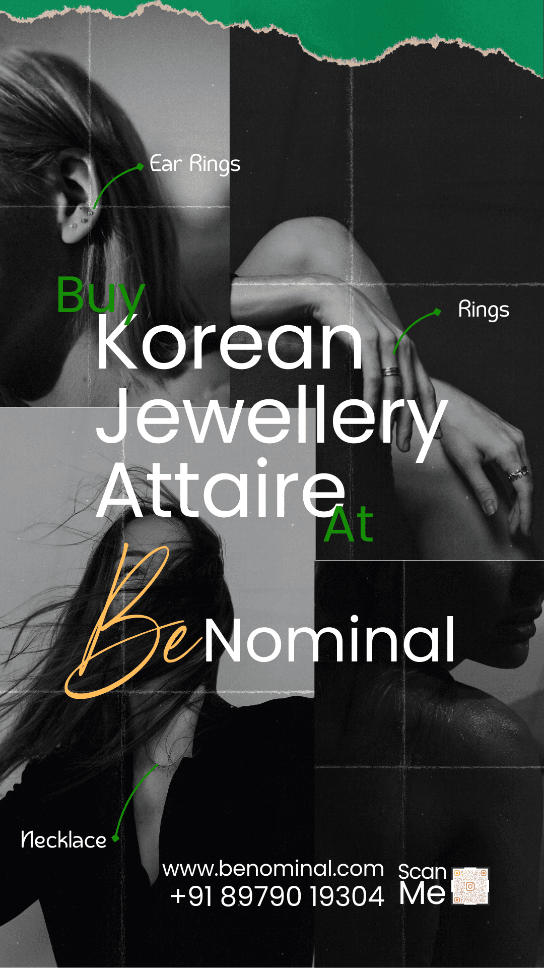
Jewelry as the Focus
The interface is intentionally quiet so the product carries emotional weight.
No competing UI elements
No aggressive CTAs
No unnecessary motion
This allows the jewellery to feel intimate and intentional.
Identity System
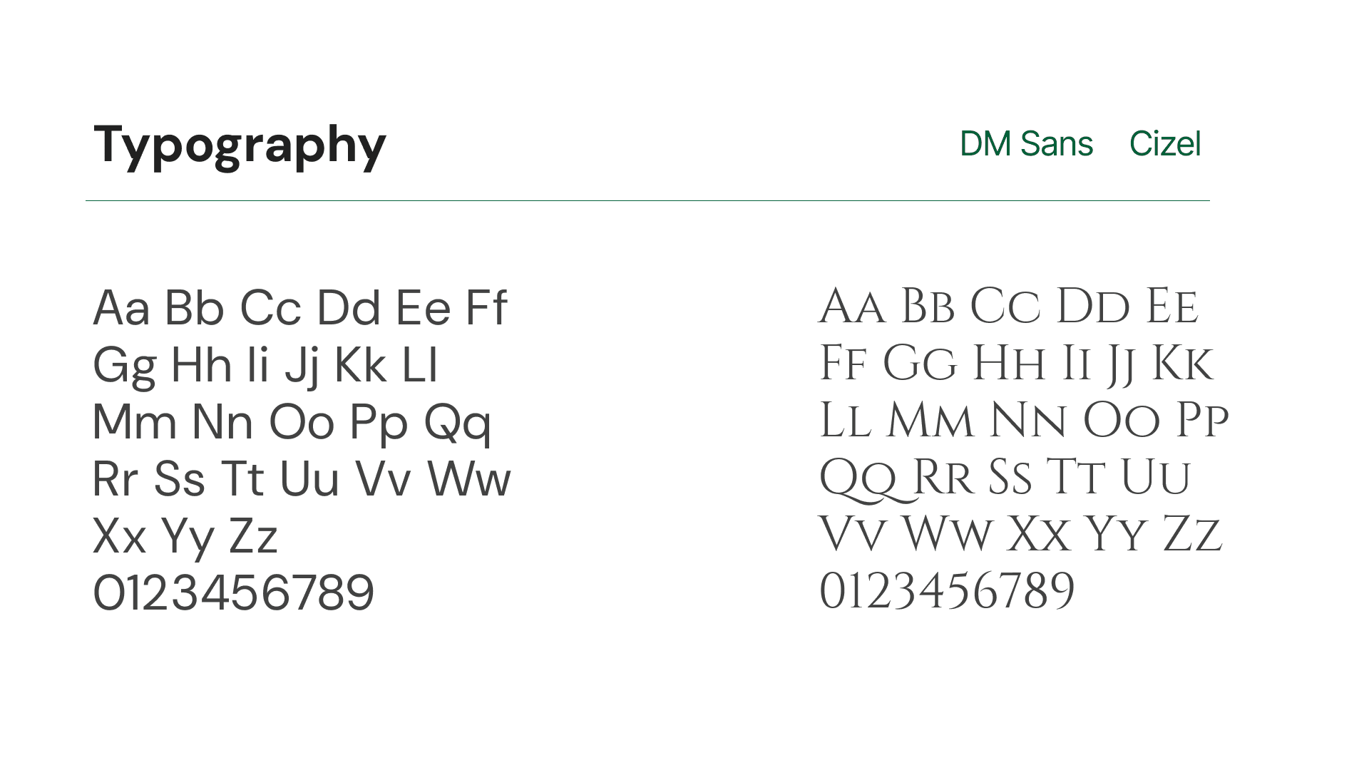
Typography
Clean, modern typography was chosen to:
feel contemporary
avoid traditional jewellery clichés
work consistently across product, web, and social
The type system is functional first, expressive second.
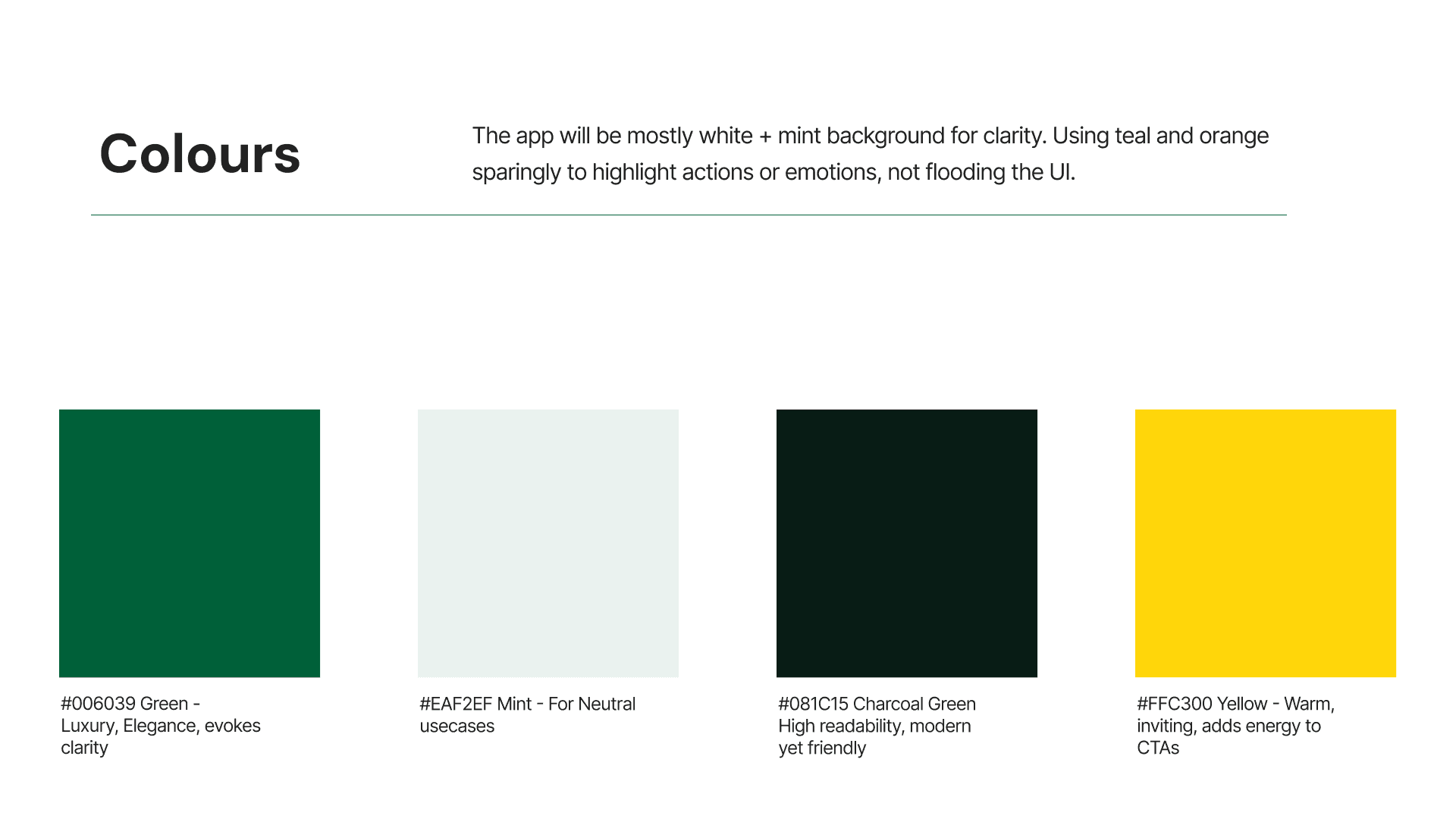
Color System
The color palette was designed to:
support different metal tones
remain consistent across photography
avoid trend-driven shades
This ensures longevity and scalability.
UI & Web Design Decisions
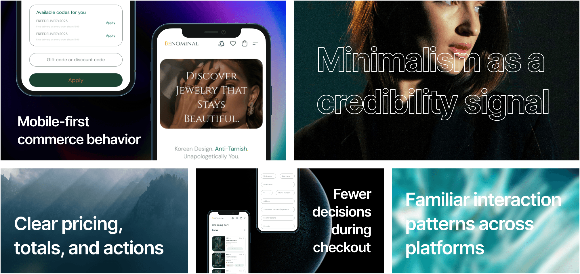
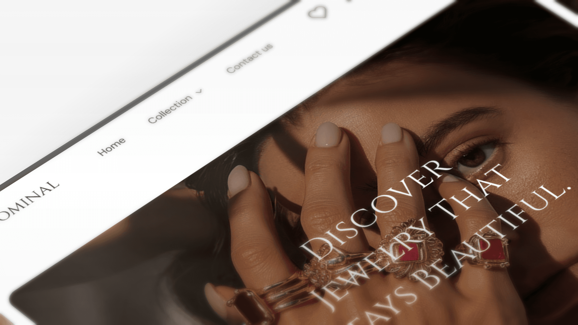
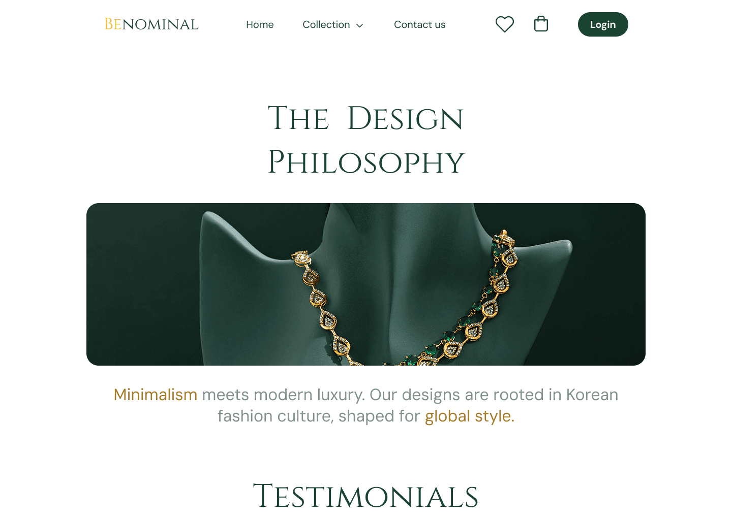
Homepage
The homepage acts as an editorial canvas:
minimal copy
strong product imagery
clear hierarchy
It introduces the brand through mood, not messaging.
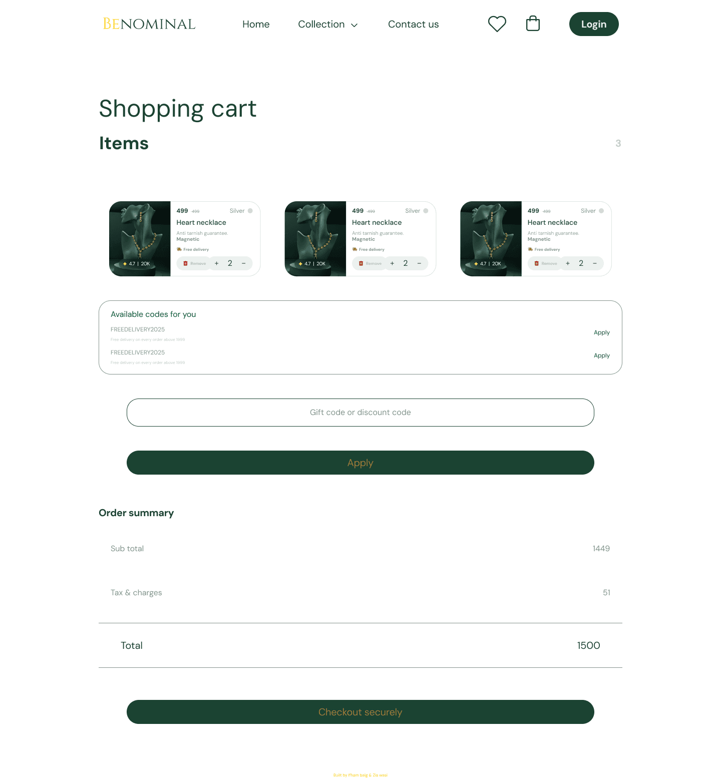
Product Pages
Product pages prioritize:
clarity
material detail
scale and spacing
Information is structured to reduce friction and decision fatigue.
Navigation & Flow
Navigation is intentionally simple:
fewer choices
predictable patterns
reduced cognitive load
This supports browsing as a calm experience, not a funnel.
Outcomes (Design-Level)
The final system feels:
modern without being trendy
premium without being distant
expressive without excess
Benominal’s design supports long-term brand growth by focusing on consistency, calm interaction, and trust — not short-term visual impact.
Reflection
Benominal reinforced an important design belief for me:
when the product carries emotional value, design should step back.
The work wasn’t about making jewellery look luxurious.
It was about making it feel personal and lived-in.
My Role
Brand strategy · Visual identity · UI & web design · Design system
Category:
Brand & UI design
Client:
Benominal